Understanding Classification Thresholds Using Isocurves
As a data scientist, you might say…“A blog post about thresholds? It’s not even a data science problem, it’s more of a business decision.” And you would not be wrong! Threshold selection lacks the appeal of say, generative adversarial networks.
Now you are in a conference room, presenting your work on a classification problem. You demonstrate all the magic you performed with feature engineering, predictor selection, model selection, hyperparameter tuning, and ensembling. You conclude your presentation with the predicted probabilities and the ROC curve, and an excellent AUC. You sit down confident in a job well done.
And the manager says, “What am I supposed to do with all this probability and ROC stuff? I just want to know if I should do x or y.” Where x might be, should I classify this message as spam or not? Or should my Tesla hit the brakes faced with this road condition? Or should I approve this loan or not?
This post is for you.
Your job as a data scientist isn’t done until you explain how to interpret the model and apply it. That means threshold selection for the business decision that motivated the model.
Here’s a deep dive into threshold selection, including the F1-score and how it compares to other metrics. Let’s dive in!
1. You need a metric or a cost function to optimize.
A business doesn’t care about winning a Kaggle contest. The only valid reasons for a business to spend money on data science are to:
- Acquire and retain customers…
- Reduce costs…
- Otherwise execute the business better, which…
- Increases profits.
If you understand the business objective of the model, what key performance indicators (KPIs) the model can improve, and apply a scientific method to asking the right questions and improving those KPIs, you may be an A-team data scientist.
Threshold selection is necessary in the context of an algorithm which predicts the probability that an observation will belong to the positive class. This is how most (but not all) classification algorithms work. The question then becomes, if we need to make discrete predictions based on the modeled probability, what is the best threshold to classify an observation as positive?
The first question to ask is: Can you quantify the cost of type I and type II errors using KPIs the business cares about? What is the marginal cost of a false positive, and what is the marginal cost of a false negative? If you can identify the right cost function, your job is essentially done.
Select the threshold that minimizes the total cost of false positives and false negatives in cross-validation. (Always in cross-validation: never select a hyperparameter or make any decision about your model using training data or test data; the classification threshold can be considered a hyperparameter.)
Suppose we are predicting whether a borrower will default on a credit card. Extending credit that should have been denied costs $50,000 in credit losses and administrative costs. Denying credit that should have been extended results in a loss of the $10,000 lifetime value of the customer (LTV). Pick the threshold that gives the lowest total cost of false positives and false negatives over your cross-validation set (or folds).
2. The ROC curve visualizes the set of feasible solutions, as you vary the classification threshold, implicitly varying the cost of false positives relative to false negatives.
If the positive class represents the detection of a stop sign or a medical condition, the cost of a false negative is high. You need a low threshold to minimize false negatives, which cause you to blow through an intersection and collide with traffic or fail to obtain further life-saving diagnosis or treatment.
If your problem is spam detection, blocking an important email is more costly than letting through a spam message. So you prefer to tilt toward a higher threshold to tag email as spam, to minimize false positives.
This is the ROC plot from a Kaggle data set.
Figure 1. The ROC Curve
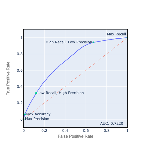
Let’s review how to interpret the ROC plot:
-
A true positive is a true observation correctly predicted to be true.
-
The true-positive rate (TPR) is the number of true positives / ground truth positives (also called recall or sensitivity). Ground truth positives = true positives + false negatives:
\[TPR = \frac{tp}{tp+fn}\] -
A false positive is a false observation incorrectly predicted to be true.
-
The false-positive rate (FPR) is the number of false positives / ground truth negatives (1 — FPR is the specificity). Ground truth negatives = true negatives + false positives:
\[FPR = \frac{fp}{tn + fp}\] -
The best place to be on the ROC chart is the top left corner, with 100% TPR, sensitivity, or recall, and 0% FPR, or 100% specificity. This is usually not feasible.
-
The best feasible points are on the ROC curve. As you move from left to right, you decrease your threshold to classify an observation as positive. You get more true positives, but also more false positives.
-
A good analogy is fishing with a net: As you use a finer net, a smaller number of fish slip through, but you also catch more seaweed and garbage. The $64,000 question is how fine a net to use for the best possible results.
3. The slope of the ROC curve reflects how many true positives you gain for each false positive you accept.
Let’s discuss how to interpret the slope of the ROC curve.
Figure 2. The Slope of the ROC Curve
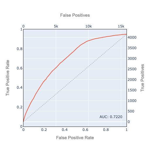
We plot the TPR on the left axis and the FPR on the bottom axis. And we also plot the 45º line as a dashed line. The 45º line is the ROC curve you would get if you classified your observations randomly using the base rate. In this example, about 20.8% of observations are ground truth positive. If you use a random classifier which randomly classifies 20.8% as positive, your ROC curve will approximately follow the 45º line. It’s the best AUC (Area Under the ROC Curve) you can get without doing any modeling. Or the worst-case AUC of a failed attempt at modeling which is unable to find any predictive signal.
Recalling that the TPR is true positives as a percentage of ground truth positive, we put the actual true positive count on the right axis. Likewise, since the FPR is false positives as a percent of ground truth negatives, the actual false positive count is on the top axis.
This helps us interpret the slope: The slope is the number of additional true positives you gain by accepting one additional false positive. (An approximation, keeping in mind that the ROC curve is made up of discrete points).
The 45º line has a slope of 1 in TPR/FPR space (percentage point increase in TPR per percentage point of FPR). In raw true positive/false positive space, the slope of the 45º line is the total number of positives/total number of negatives.
If the positive class occurs with probability p, the slope is: \(\frac{p}{1 - p}\)
If you have an ideal ROC curve with a continuously decreasing slope (concave down), you can start at the bottom left and keep going toward the top right as long as the cost of additional true positives expressed in false negatives is acceptable.
Real-world ROCs are often messier, and may not have a continuously decreasing slope as you modify your threshold. But the ROC curve is always positively sloped, and never flat or vertical except at the edges. That would imply two points where one is better on one dimension and equal on the other. Then only one can be an optimal solution, and only that one should be on the ROC curve. Furthermore, most reasonable threshold selection methodologies we discuss below will tend to ignore points in regions that aren’t on the ROC’s outer ‘hull’ but are in local dips toward the bottom right. So thinking about a ROC curve with continuously decreasing slope is reasonable.
4. Precision, recall, and the F-score
Now, what happens if you can’t pin down the real-world cost of false positives and false negatives?
A frequently used metric is the F1-score, which is the harmonic mean of precision and recall.
-
Precision is true positives/predicted positives, i.e. % of our positive predictions that we predicted correctly.
-
Recall is TPR: true positives/ground truth positive, i.e. % of ground truth positives that we predicted correctly.
-
To calculate the harmonic mean, we invert the inputs, calculate their mean, then invert the mean:
To gain intuition about the harmonic mean: If a vehicle travels a distance d outbound at a speed x (e.g. 60 km/h) and returns the same distance at a speed y (e.g. 20 km/h), then its average speed is the harmonic mean of x and y (30 km/h).
This is *not* equal to the arithmetic mean (40 km/h), which would be applicable if you traveled an equal time in 2 different-speed legs.
If speed is near 0 on either leg, the harmonic mean will be near 0 for the whole distance regardless of the speed on the other leg. If the speed is exactly 0 on either leg, you never get to your destination, so the average speed for the whole trip is 0.
The F1-score balances precision and recall and penalizes extreme weakness in either one.
The F1-score is not symmetric. We have an unbalanced 79.2%/20.8% ratio of negatives/positives. Suppose our classifier predicts everything as positive. Then recall is 1, precision is 0.208, F1 is 0.344. Now suppose the labels are reversed, you predict everything as positive, recall is 1, precision is 0.792, F1 is 0.884. This looks great but it’s not, since all we did was classify everything as the majority class. Due to this asymmetry, we are always careful to label the minority class as the positive class when we calculate the F1-score.
Asymmetry is sometimes fine. Sometimes the business problem is asymmetric. In a search engine application, we don’t care much about all the documents we didn’t retrieve.
We can tilt the threshold toward precision or recall by using a weighted mean instead of an equal-weighted mean, in which case we call it F2-score etc.
F-score seems reasonable, although the applicability of the harmonic mean to threshold selection is not completely intuitive to me. I’ve never encountered a business problem where the real-world cost function of false positives and false negatives is a harmonic mean.
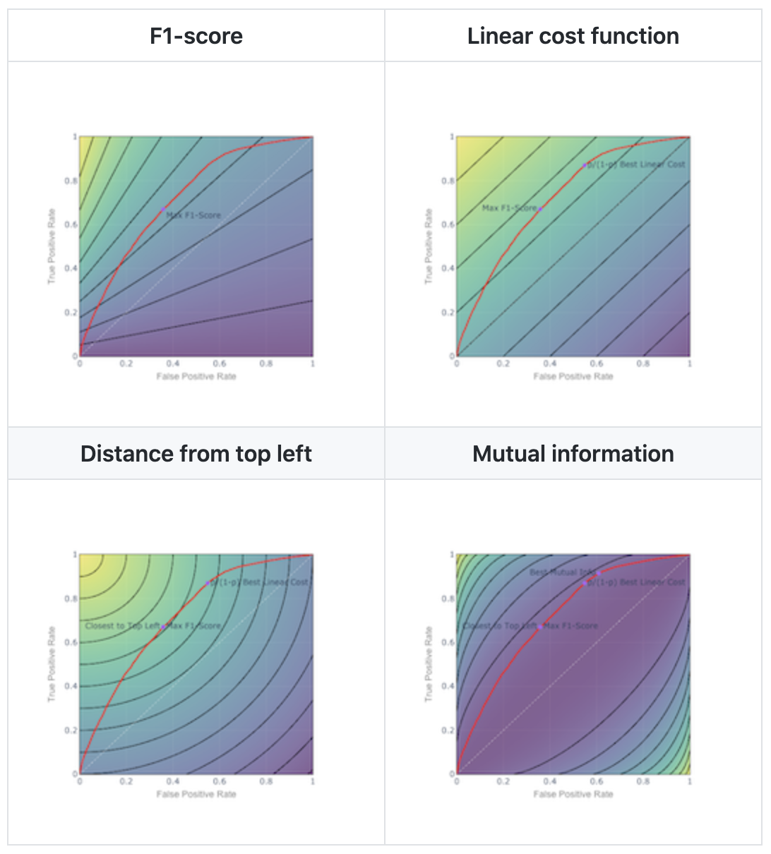
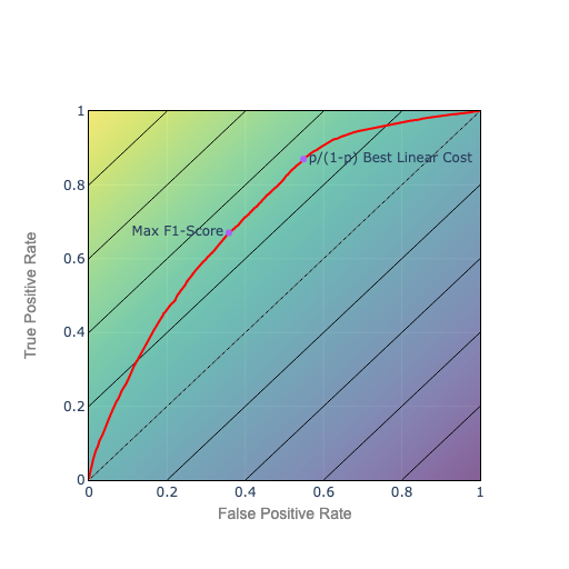
5. Isocurves help you visualize any scoring or cost function like F1
If you want the best tradeoff, it helps to visualize the tradeoff with isocurves. An iso-cost curve or indifference curve depicts a set of points that have the same cost or metric value: for instance all the points with an F1-score of 0.5. This lets you visualize how the metric evolves as you move along the ROC curve.
For the F1 metric, the isocurve plot looks like this.
Figure 3. F1-score Isocurves
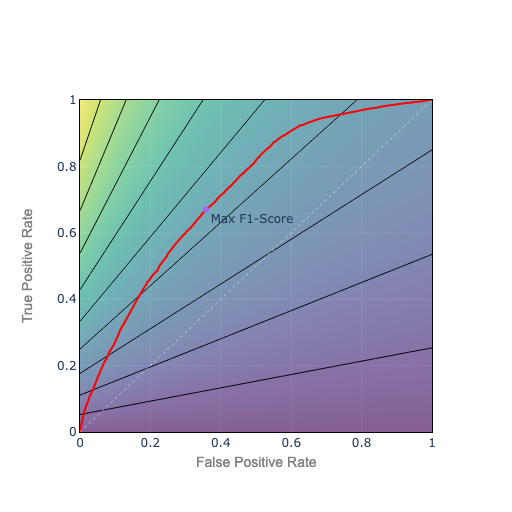
- Bottom axis: recall = 0, F1 = 0
- Top left: we classify perfectly: recall = 1, precision = 1, F1 = 1
- Top right: we classify all positive: recall = 1, precision = 0.208, F1 = 0.344
To choose the point with the highest F1, pick the point on the ROC curve which sits on the best F1 isocurve, the isocurve closest to top left.
6. Linear cost isocurves
F-score is a nonlinear cost function. If the cost function is a linear function of TPR and FPR (or false positives and false negatives), the relative cost to trade one false positive for one false negative is constant, and you have evenly spaced linear isocurves.
Figure 4. Linear Cost Isocurves
Again, choose the point on the ROC curve which is also on the isocurve closest to the top left. In this example, the relative price is p/(1-p). So the isocurves parallel the 45º line, which corresponds to a random classifier using the base rate p.
Comparing to F1 isocurves, as you go up, F1s get higher faster on the left. So as you improve your ROC, all else being equal, the path connecting best F1 points will curve toward the left (concave down). The path connecting the best linear costs will be a straight line. Proof, as they say, left as an exercise.
We can weight the relative cost of false positives to false negatives. As we do, the slope of the isocurves changes, and we will tend to favor precision over recall or vice versa.
7. Circular or ‘closest to top left’ isocurves
Suppose we want to be as close as possible to top left by Euclidean distance. That corresponds to circular isocurves. The cost function is the distance from the top left:
Figure 5. Closest to Top Left: Circular Isocurves
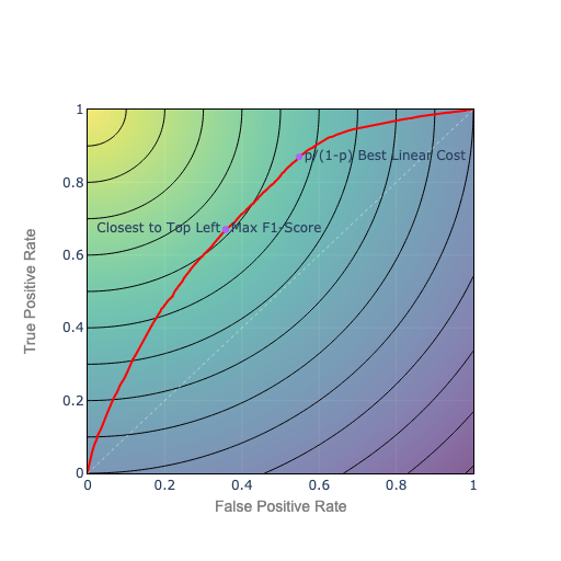
We could also weight the terms under the square root to favor precision or recall, and squash the circular curves into elliptical curves.
Compared to constant cost isocurves, the circular isocurves will tend to keep the optimal point toward the middle, near the diagonal ridge, balancing precision and recall.
8. Mutual information
Finally, let’s look at mutual information. Mutual information is an information theory metric, like log loss. Log loss can be interpreted as the wrongness, or surprise in our prediction vs. the actual outcomes, measured in bits. Mutual information can be interpreted as the amount of correct information in our prediction, measured in bits.
Mutual information is what we use to measure the bandwidth capacity of a signal over a telephone wire or radio channel. We can view a prediction as a signal about the future. In the same sense that mutual information measures how much useful signal can be transmitted on a channel, mutual information tells us how much useful information we have about the future.
If we use mutual information as our cost function, we get isocurves that look like this.
Figure 6. Mutual Information Isocurves
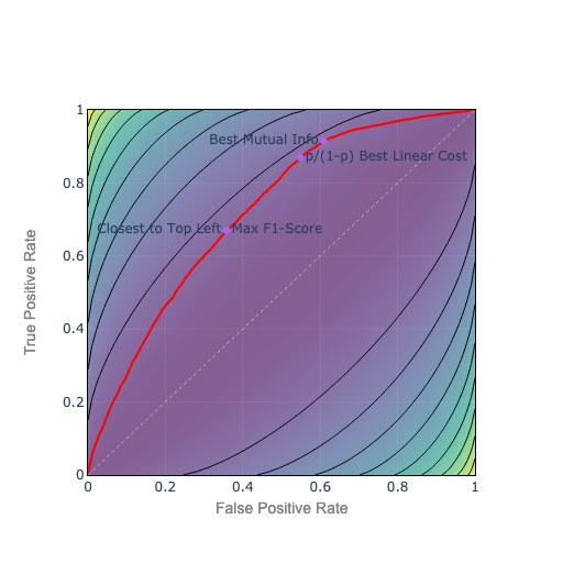
Maximizing mutual information, in an information theory sense, minimizes the bits of surprise or wrongness in the prediction, and maximizes the bits of ‘correct’ information. Absent explicit costs for false positives and false negatives, mutual information seems like a natural metric choice.
However, mutual information isocurves match the general shape of the ROC curve. So they may not be very stable in terms of choosing whether to err on the side of precision or recall.
The choice to lean toward precision or recall is based on whether the algorithm is better at precision or recall, as opposed to any real-world cost. So the choice of threshold might be arbitrary and hard to interpret.
It’s also worth noting that a perfectly wrong prediction contains the same mutual information as a perfectly correct prediction because you could extract the correct prediction from that signal. This too is a counterintuitive.
Mutual information has theoretical appeal but interpretability is challenging.
9. Concluding remarks
When I started building classification models, I frequently used F1 scores. Now, I generally use AUC for model selection and hyperparameter tuning. For threshold selection, I try to identify the most relevant real-world metric.
I find linear isocurves easiest to interpret. In the absence of a good prior cost function I also find it easier to justify p/(1-p) than F1 or the other more complex metrics. Circular isocurves are harder to interpret but favor a balance between precision and recall. But empirically F1 performs well.
To choose a threshold, you have to maximize something. The metric you maximize should be interpretable and correlated to real-world costs.
Takeaways:
- Threshold selection is where data science meets real-world decision-making.
- Don’t automatically use a 50% threshold or even F1-score; consider the real-world costs of false negatives and false positives.
- To select a threshold you have to optimize for some metric: a cost function.
- The business context determines the cost function you are optimizing: the real-world tradeoff you are willing to make between type I and type II error; how far you should reduce your threshold to get more true positives at the expense of more false positives.
- An isocurve contour plot is a visualization that provides a good intuition of your cost function whenever you have to trade off two variables.
- When you minimize the cost function, you choose the optimal classification threshold where the ROC curve intersects the lowest cost (or highest metric) isocurve.
Isocurves can be applied to make rational choices between any set of competing alternatives, not just classification thresholds. This post covers about 30% of the most important principles of economics: People face tradeoffs; The cost of something is what you have give up to get it; Rational people think at the margin; You have to choose what to maximize.
Selecting thresholds that optimize KPIs and achieve business objectives maximizes your value as a data scientist…a truly optimal outcome.
The code for the visualizations is on GitHub.
See also:
Fawcett, Tom. “ROC graphs: Notes and practical considerations for researchers.” Machine learning 31.1 (2004): 1–38. https://www.hpl.hp.com/techreports/2003/HPL-2003-4.pdf
Swets, John A., et al. “Better DECISIONS through SCIENCE.” Scientific American, vol. 283, no. 4, 2000, pp. 82–87. JSTOR, www.jstor.org/stable/26058901.
Grandenberger, Greg, Evaluating Classification Models, Part 3: Fᵦ and Other Weighted Pythagorean Means of Precision and Recall